AboutNAD.com
Empowering health through scientific education Aboutnad.com provides comprehensive examination of NAD+'s role in human health by delivering the latest educational content backed by peer-reviewed research or ongoing clinical trials.


Empowering health through scientific education Aboutnad.com provides comprehensive examination of NAD+'s role in human health by delivering the latest educational content backed by peer-reviewed research or ongoing clinical trials.
.jpg)
I led the design direction and transition strategy for the aboutnad.com website replatform, partnering closely with stakeholders, product, and development to ensure a smooth migration without disrupting brand integrity or momentum.I was embedded in cross-functional working sessions to guide decisions in real time, helping align technical constraints with creative intent. This included safeguarding the visual language of the brand throughout the replatform, refining layouts, typography, and component usage so the new site felt familiar yet elevated. I also supported hands-on page buildouts, reviewing and shaping key templates, adjusting hierarchy and content flow, and ensuring each page met brand standards while functioning effectively within the new platform.
Design Director
AboutNad.com
2025
Color Palette
BF3A2B
1C1C1C
FFFFFF
1C1C1C
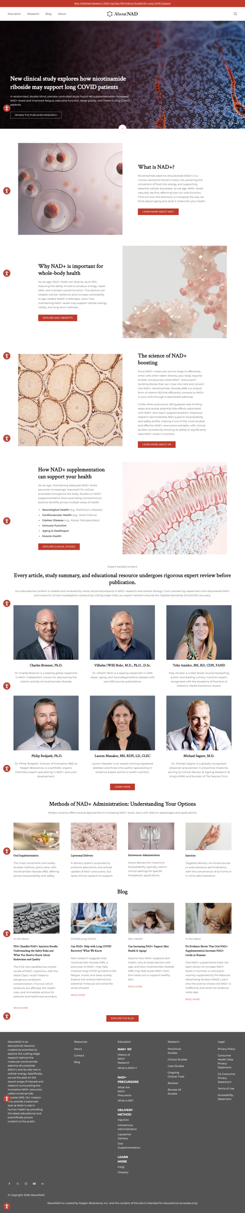
Designed with clarity and focus in mind, the desktop experience prioritizes structure, readability, and visual hierarchy. Layouts are intentional and flexible, allowing content to breathe while guiding users through each narrative with ease.
Designed with clarity and focus in mind, the desktop experience prioritizes structure, readability, and visual hierarchy. Layouts are intentional and flexible, allowing content to breathe while guiding users through each
Strong typography and spacing create clear pathways for content consumption and storytelling.
Simple, intuitive navigation allows users to move effortlessly between sections without distraction.

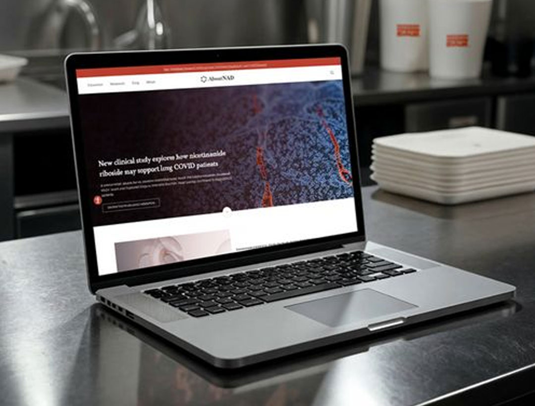
Built for speed, usability, and modern browsing habits, the mobile experience delivers the same depth and clarity as desktop — optimized for smaller screens and touch interaction.
.jpg)
Layouts adapt seamlessly across devices while maintaining design integrity.
Streamlined menus and thumb-friendly interactions ensure effortless browsing on the go.
Animations and transitions feel natural, responsive, and purposeful.
Design elements scale gracefully, preserving brand identity across all screen sizes.
The replatform launched with minimal friction, preserved brand equity, and delivered a cohesive, on-brand experience across all pages.
.png)
.png)
.png)
.png)
.png)
©2026 Lucie Tran
Back to top

.png)